Green Mechanics Website Redesign

UX Research & UI Design / 2025

Project Overview

Primary Goal

Enable visitors to figure out if Green Mechanics is right for them in five clicks or less.

Objectives

Create a user-friendly website that showcases environmental services and allows potential clients to quickly understand Green Mechanics' offerings.

Duration

9 Months
End-to-end UX Redesign

My Role
  • Narrative Design & Writing
  • UX & Choice Architecture
  • Front-end Development
  • Playtesting & Iteration

Before & After

Impact & Outcome

Fill in?

Redesigned Core Pages

Homepage, service pages, and outreach content redesigned for clarity and trust-building.

Interactive Prototype

Delivered full high-fidelity Figma prototype to support client implementation.

Scalable Design System

Created a modular design system enabling future site growth and consistency.

Understanding the Problem Space

Our Team's Assumptions

  • Users had difficulty understanding the services offered
  • Visual design lacked credibility
  • Content was too technical and unclear
  • Navigation was confusing

Client Meeting

  • Emphasized the importance of showcasing impact, not just listing services
  • Wanted a website that builds trust and feels professional

Competitive Analysis

  • Compared 3 similar sustainability-focused websites
  • Found others used clear categories, client success stories, and testimonials
  • Identified lack of branding and trust signals on current site

User Interviews

  • Conducted 14 participant interviews
  • Pain points: confusing layout, unclear mission, and no visible proof of impact
  • Insights directly informed design decisions

Sprint Timeline

1

Grounding & Goal-Setting

We aligned with our client on mission and scope through a kickoff meeting, content audit, and competitive peer analysis. We identified design gaps and set a clear foundation for the project.

2

Research & Real Voices

User and stakeholder interviews uncovered pain points around clarity, navigation, and trust-building, which shaped personas and a new site map.

3

Ideas into Interfaces

Using Crazy 8s and sketching exercises, we translated research insights into low-fidelity wireframes to explore layout options.

4

Brand & Visual Identity

Through a branding workshop, we established Green Mechanics' design system and brand guidelines.

5

Polish, Test & Deliver

We refined designs through iterative prototyping, tested usability with stakeholders, and finalized client-ready deliverables.

Research Strategy & Goals

We began our research phase with a goal to improve content clarity and showcase Green Mechanics’ services more effectively. Our research was driven by the following question:

“What are the expectations of users who visit the Green Mechanics website and how well does the website showcase available services and past projects in a way that is visually appealing and easy to navigate?”

Target Audience Segmentation

  • Past Clients
  • Internal Staff
  • Collaborators

Methods – Contextual Inquiry

  • User Interviews: Conducted with 14 participants
  • User Testing: We embedded usability testing into each interview. Participants shared their expectations and described what they needed in order to trust and understand Green Mechanics’ services. These insight directly informed our design decisions

Artifacts Developed

User Journey Map artifact

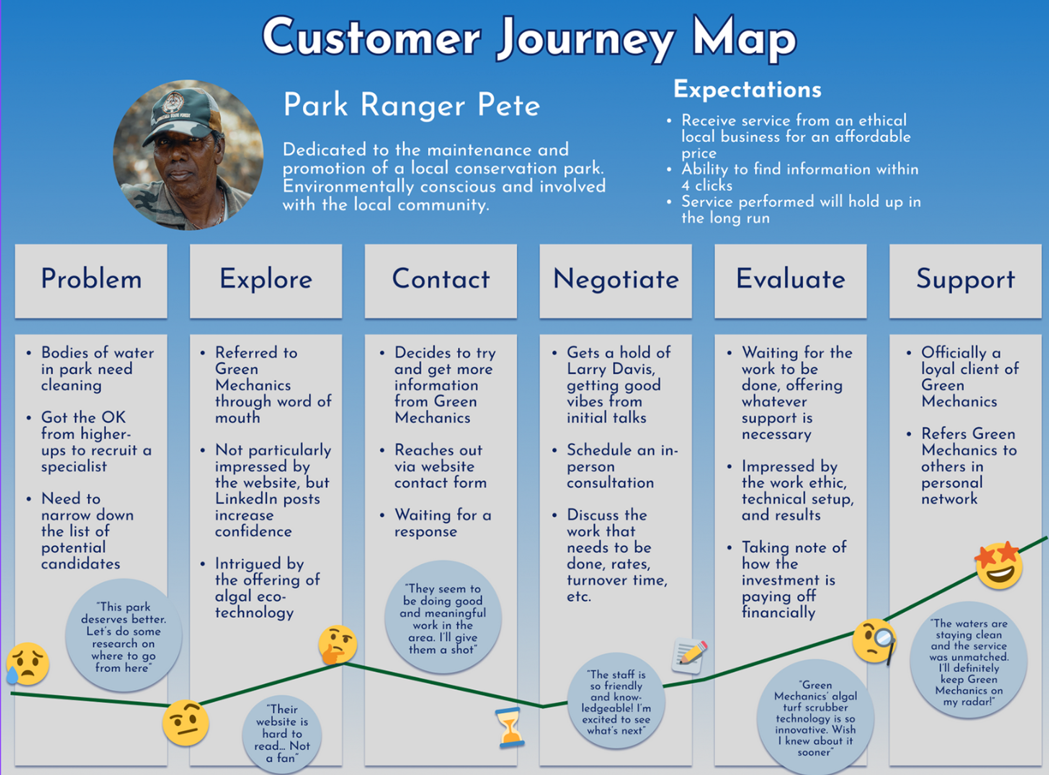
We developed a Customer Journey Map to visualize the experience of key user groups, identifying frustrations, expectations, and trust-building opportunities across stages.

Bar chart summarizing participant concerns

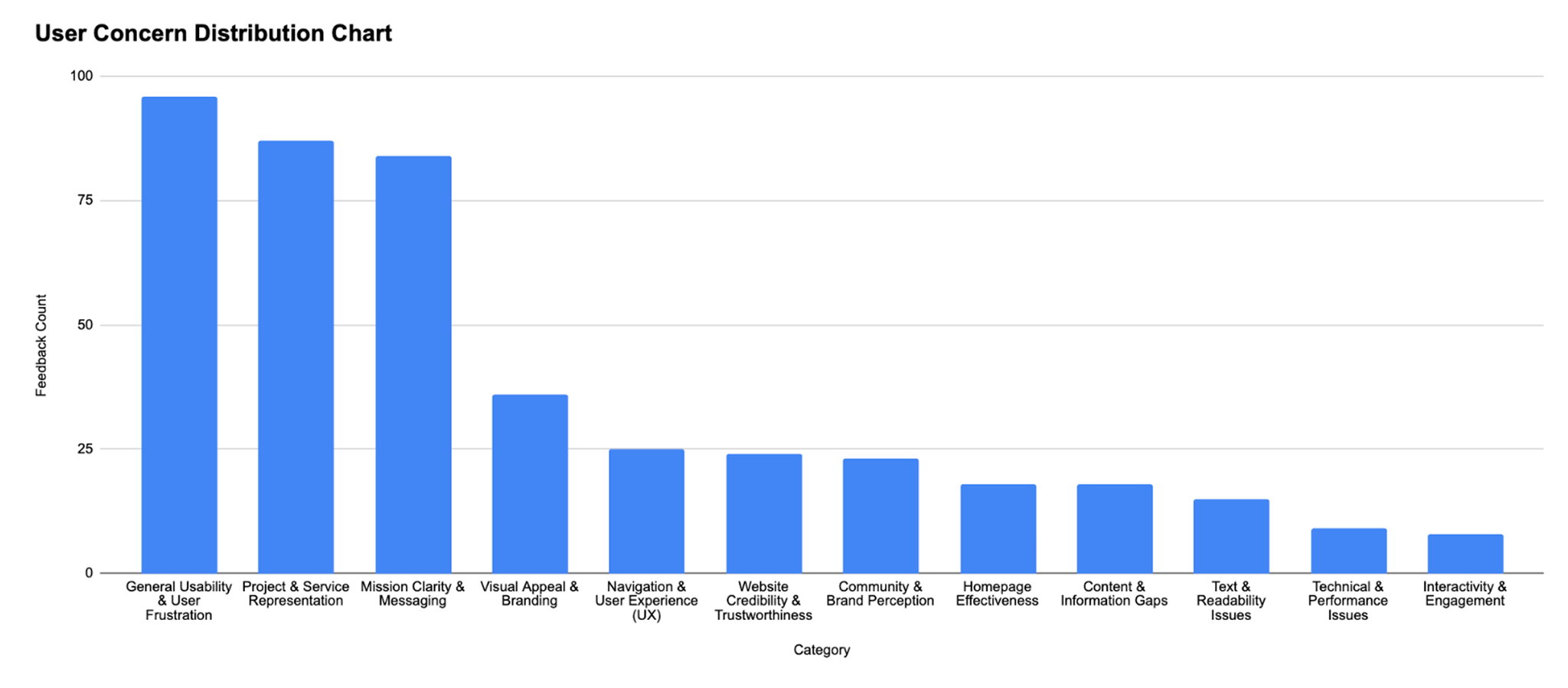
Bar chart summarizing recurring user pain points across navigation, messaging, and trust-building elements. This quantitative analysis of interview data highlighted common patterns and directly informed our design priorities and content strategy.

How Might We strategy board

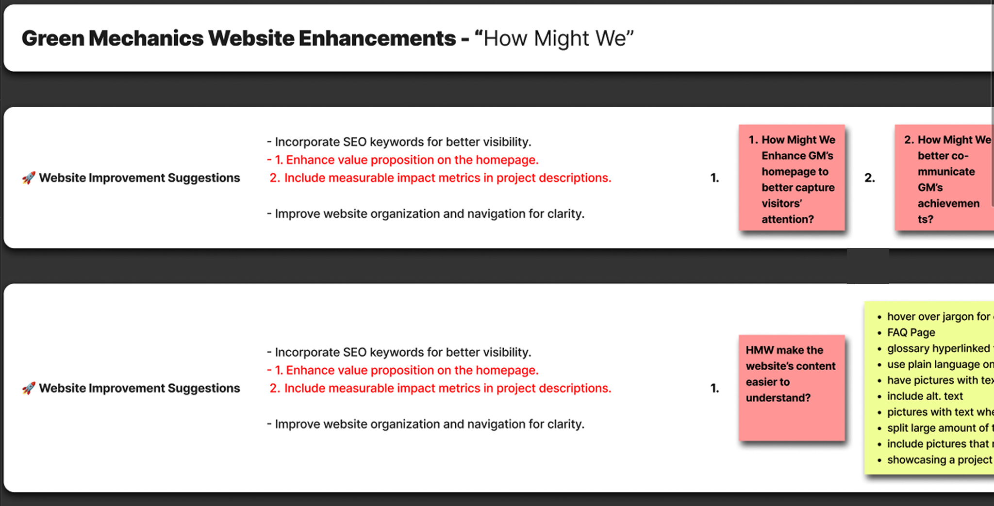
Building on our research, we identified key focus areas using "How Might We" framing to structure actionable design solutions.

Research Highlights

Our research helped us gain a clearer understanding of the marketing and content design improvements that would align with both user needs and client goals.

01

Content & Messaging Challenges

  • Dense technical language confused non-expert audiences
  • Mission and values were unclear or buried
  • Service descriptions lacked plain language clarity
02

Trust & Credibility Gaps

  • Missing proof of impact (case studies, client stories, metrics)
  • Inconsistent visual design and branding reduced credibility
  • Site lacked trust-building content and signals
03

Navigation & Usability Pain Points

  • Users struggled to locate services and understand full offerings
  • Visual distractions reduced focus
  • Navigation labels lacked clarity

(UX Principles in Action)

1

Information Architecture & Navigation

  • Restructured navigation using card sorting insights
  • Grouped services into intuitive categories
  • Simplified homepage for quicker comprehension
2

Visual Hierarchy & Branding

  • Established consistent typography, colors, and iconography
  • Highlighted trust-building content through hierarchy
  • Used authentic project photos in place of stock imagery
3

Content Strategy & Messaging

  • Rewrote services in plain language
  • Clarified mission statements
  • Added case studies and impact metrics
4

Accessibility & Usability

  • Responsive design for mobile and tablet devices
  • Improved spacing, contrast, and font sizing
  • Applied accessibility best practices

Reflection & Outcomes

This project reinforced the power of user-centered design to simplify complex information, build trust, and align design solutions with real organizational goals.

  • Clarified services and simplified complex content for potential partners
  • Aligned design decisions closely with client needs through weekly collaboration
  • Strengthened skills in information architecture, content strategy, and trust-building UX
  • Delivered a complete high-fidelity prototype, content recommendations, and scalable design system

What I Learned

Communication is Key

  • Weekly check-ins improved client communication
  • Defined team protocols for smoother collaboration

Work Smarter, Not Harder

  • Grouped interview insights at a high level to manage data volume efficiently

Know Your Limits

  • Revised scope and priorities to match timeline constraints